PrintToPDF
Description
It is used to print the content of the Widget. Currently, only printing of Tabulator widget is supported.
Properties
Specific
-
Widget
EXPRESSION (widget)
-
Reference to the Tabulator widget. See
Output widget handleproperty to find out how to obtain this reference. -
Options
EXPRESSION (json)
-
You can specify following print options through JSON:
-
landscape boolean (optional) – Paper orientation.true for landscape, false for portrait. Defaults to false.
-
scale number(optional) – Scale of the webpage rendering. Defaults to 1.
-
pageSize string | Size (optional) – Specify page size of the generated PDF. Can be A0, A1, A2, A3, A4, A5, A6, Legal, Letter, Tabloid, Ledger, or an Object containing height and width in inches. Defaults to Letter.
-
margins Object (optional)
- marginType string | Size (optional) – Can be “default” or “custom”.
- top number (optional) – Top margin in inches. Defaults to 1cm (~0.4 inches).
- bottom number (optional) – Bottom margin in inches. Defaults to 1cm (~0.4 inches).
- left number (optional) – Left margin in inches. Defaults to 1cm (~0.4 inches).
- right number (optional) – Right margin in inches. Defaults to 1cm (~0.4 inches).
For example:
{ landscape: true, scale: 1, pageSize: "A4", margins: { marginType: "custom", top: 0.8, bottom: 0.8, left: 0.8, right: 0.8 } } -
General
-
Description
String
-
This is the description of the Action component. Description is displayed below the component in the Project editor/viewer. In the main toolbar, it is possible to hide or display descriptions of all components with one click.
Flow
-
Inputs
Array
-
Additional component inputs that the user can add as desired in order to use them to receive additional data needed when evaluating expressions in properties. Each input is given a name and type. Name is used when referencing an input within an expression. A type is used to project Check to check whether a data line that transmits data of that type is connected to the input or not.
-
Outputs
Array
-
Additional component outputs that the user can add to send data through. Each output is assigned a name and type. An example of using this output is e.g. in the Loop component, where we can put the output name for the
Variableproperty instead of e.g. variable name. In that case, the Loop component will not change the content of the variable in each step, but will send the current value through that output. -
Catch error
Boolean
-
If this checkbox is enabled then an
@Erroroutput will be added to the component and if an error occurs in this component during the execution of the Flow, the Flow will continue through that output. The data that will be passed through that output is the textual description of the error.
Position and size
-
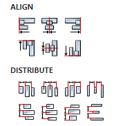
Align and distribute
Any
-
Alignment icons and component distribution. Alignment icons appear when two or more components are selected, and distribution icons appear when three or more components are selected.

Inputs
-
seqin
SEQ | OPTIONAL
-
A standard sequence input.
Outputs
-
seqout
SEQ | OPTIONAL
-
A standard sequence output.
Examples
- Tabulator Examples
